Tracking County Population Trends
The United States 2020 population estimate currently sits above 330 million. If you're reading this article, I assume you want to dive deeper into the U.S. population statistics to uncover more profound insight.
County Population Demographics & Trends
This article will utilize census data provided by the U.S. Census Bureau and demonstrate how to analyze and investigate:
County Population Growth Trends
County Demographic Trends
The data provided by census.gov is vast, but it's up to the researcher to manipulate and examine it to find meaningful insight. I will utilize pivot tables to slice census data. While I don't expect you to be an expert with Excel pivot tables, you must be familiar with their capabilities to mine the data effectively. I will cover the basics with images so you can repeat this exercise later.
When I'm doing real estate submarket research on a particular region, I am looking for population intel such as:
Total population growth of the state
Total population growth of an area such as a city, county, or MSA
How the regional growth compares to the overall state growth and overall U.S. population growth
Population by age
Population trends by age (more baby boomers or young adults moving to a region)
State-to-State population migration trends (covered in another article)
A region’s unemployment trends and other labor statistics are essential to understand.
Case Study: Erie County, New York
Let's pretend we evaluate the greater Buffalo, New York, MSA. We will act to own properties in the Northeast, but Erie County is a new market we are researching.
Clicking this link will bring you to the County and Resident Population Estimates by Age Group.
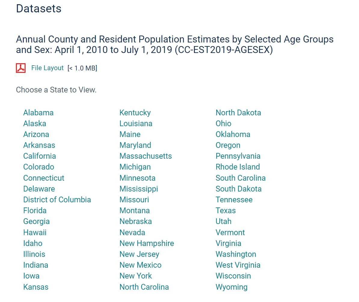
You can select your state of interest from the list (50 states and the District of Columbia). In this case, I click New York, and the Excel workbook will download.
The amount of information is overwhelming at first. There are hundreds of rows and columns of data. Bear with me; I promise we can transform this data and make it much easier to digest.
Highlight all the data by clicking the green right triangle in the upper left-hand corner of the Excel worksheet and insert a pivot table (Insert > Pivot Table).

Now, we can begin slicing the data as we see fit.
I first want to focus on just general population trends in New York. Although we are researching Erie County, let's first understand the broad picture. We'll be thankful later on.
Objective 1: See how the population has changed in the State of New York over the past decade.
I will first grab "Year" in the Pivot Table Field and place it in the “Rows” box.

Rows are labeled as 1-12. What does this mean? Thankfully, there is a key on the webpage that deciphers the years.

We know the most recent year (Year 12) is July 2019. The previous years go back to 2010. Let's see how the number of people living in New York State has changed each year spanning the last decade. We must grab "PopEstimate" from the Pivot Table Fields and place it in the "Values" box.

The population will be summarized each year in the pivot table. The gross population number is helpful, but I want to see this as a year-over-year (YOY) increase/decrease. We will again add "PopEstimate" to the "Value" section to do this. Click the little down arrow on the right and select “Value Field Settings.”
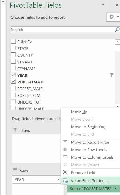
And then choose “Show Value As”:
% Difference From
Previous Year

Now, the population is summarized nicely in two different ways.

I prefer reviewing visual data, so I will insert a simple bar chart to quickly summarize the New York population data. I would format and label this bar chart differently if this were a consulting assignment or images for an investment package. I will go with the standard Excel formatting to save time now.

The population in New York has declined for the last four years. That's not a great sign, especially for a real estate investor. This, however, is the broad market and is just a baseline. Once we dig into Erie County, it will be a good idea to compare that to the state's trends. The hope is that your submarket of interest is outperforming the broader market.
Objective 2: See how the population has changed in Erie County over the past decade.
If you return to the Excel tab with all the data, it should still be highlighted when we made the previous pivot table.
This time, we will drop another pivot table on an "Existing Tab" (where the other table is hosted).
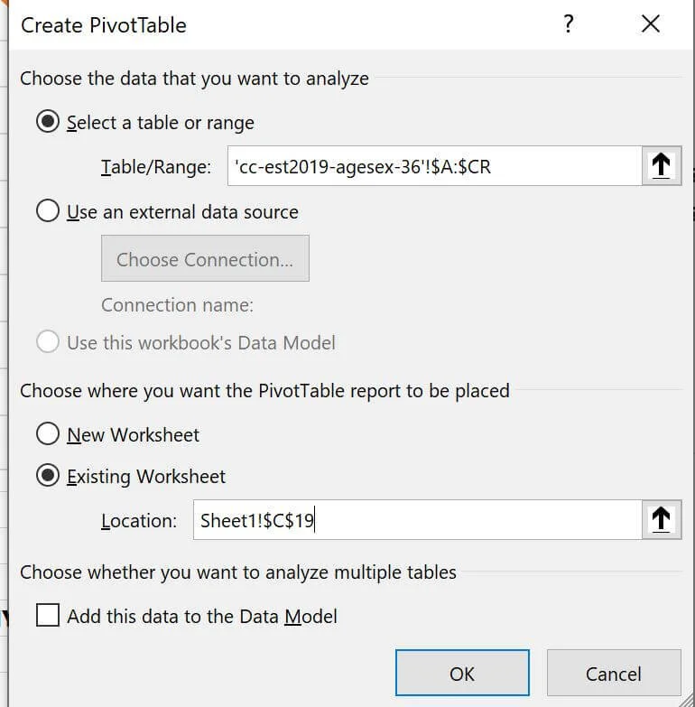
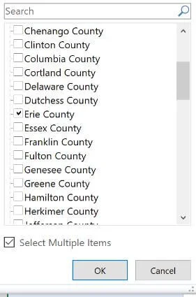
We are going to add the same data to the pivot table with an additional filter: "CTYNAME"

Since we added the filter, we can select only Erie County from up top of the pivot table.
We can see both population metrics as we did for New York.
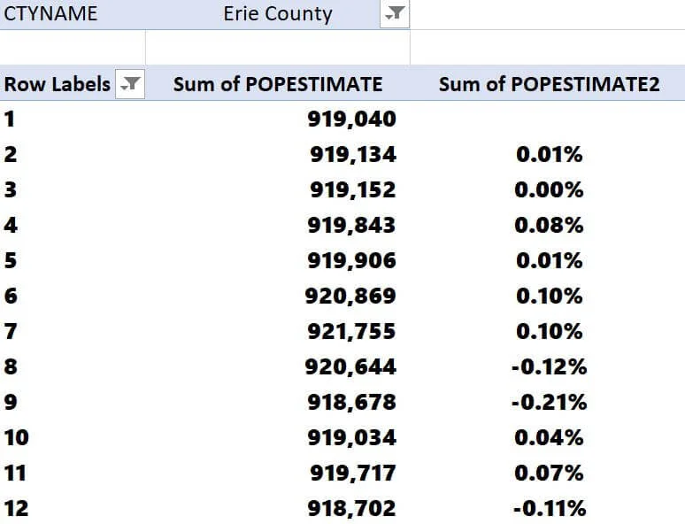
Fairly unimpressive, but if we compare the percentage of population increases and decreases each year, it's clear that Erie has been outpacing the broader New York as of late.

Looking at the 3-year population growth (July 2016 to July 2019), Erie is flat at 0%, while New York is down -by 0.92%.
While I am not thrilled with Erie's metrics, I see it as a positive that its population is trending better than the state. With these pivot tables, you can analyze the county/state on a year-over-year (YOY) basis or look at growth rates over longer horizons such as 3-year, 5-year, or 7-year periods.
Objective 3: Analyze the age demographics of the population in Erie County.
I love seeing when 25-34-year-olds move to an MSA in abundance. These people are in the prime of their careers, and typically, a high concentration of young professionals moving to a particular region indicates ample employment opportunities. I predict Erie is a bit bleak compared to other metros such as Boise, Idaho, or Austin, Texas, which have recently seen a considerable demographic shift, with younger people moving there from out of town. Regardless, I'll show you the steps to find this data too.
If you return to the Excel tab with all the data, it should still be highlighted when we made the previous pivot table.
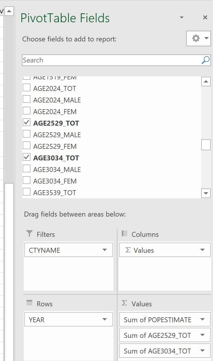
Again, we will drop a new pivot table on an "Existing Tab" (where the other tables are hosted).
The filters will be similar to past examples, except this time, let's grab population totals for:
25-29-year-olds
30-34-year-olds
Off to the side of the pivot table, I am going to do some manual calculations:
I will add the 25-29 + 30-34 Ranges
Divide by the Total Population Estimate
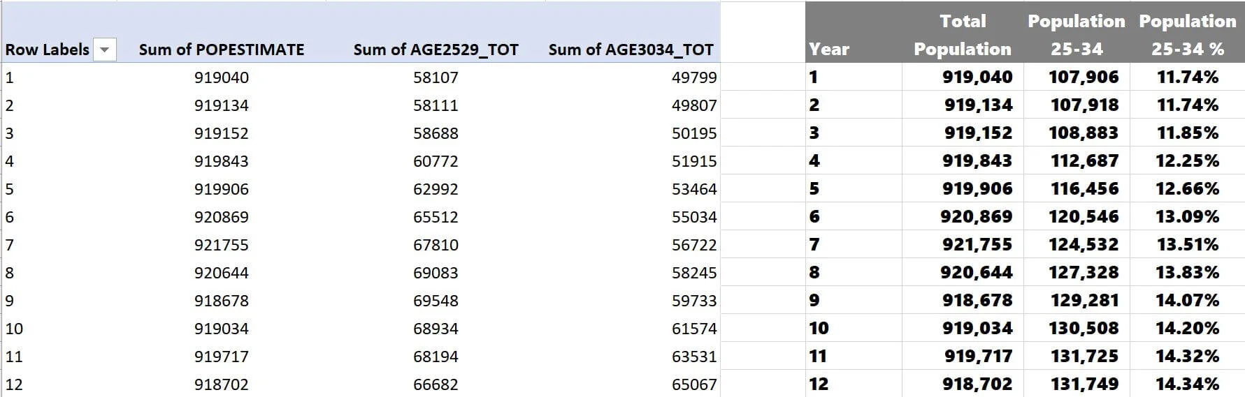
There's a very positive trend with an increasingly younger population! 22% growth in nine years is nothing to scoff at, although the clip has recently decreased. Especially when the population has declined, you could also compare the 25-34-year-olds in Erie to New York and see how the submarket trends compare to the state trend. Or compare Erie to other MSAs you are investing in.
Summarizing County Population Analysis
When underwriting a commercial real estate building, population trend analysis will come before any property-specific research. Population trends could be a significant factor in whether a specific business plan can be executed for a particular asset class in a city.
Other Related Content: